¶ Forms Module & Dashboard
The Tangilla forms dashboard allows you to see a list your forms, search for a specific form, filter your search results by form catagory, and add a new form.
¶ Forms List
Your list of forms is organized by Form Name, Category, Form Type, Status, Responses and Integrations. You may sort the forms list by Form Name or Category. The forms list also clearly displays the number of responses to any individual form and the number of integratons any individual form has attached to it.

Clicking on any individual form line or the - - icon will take you to the Individual Form Dashboard (detailed below).
¶ Search & Filter
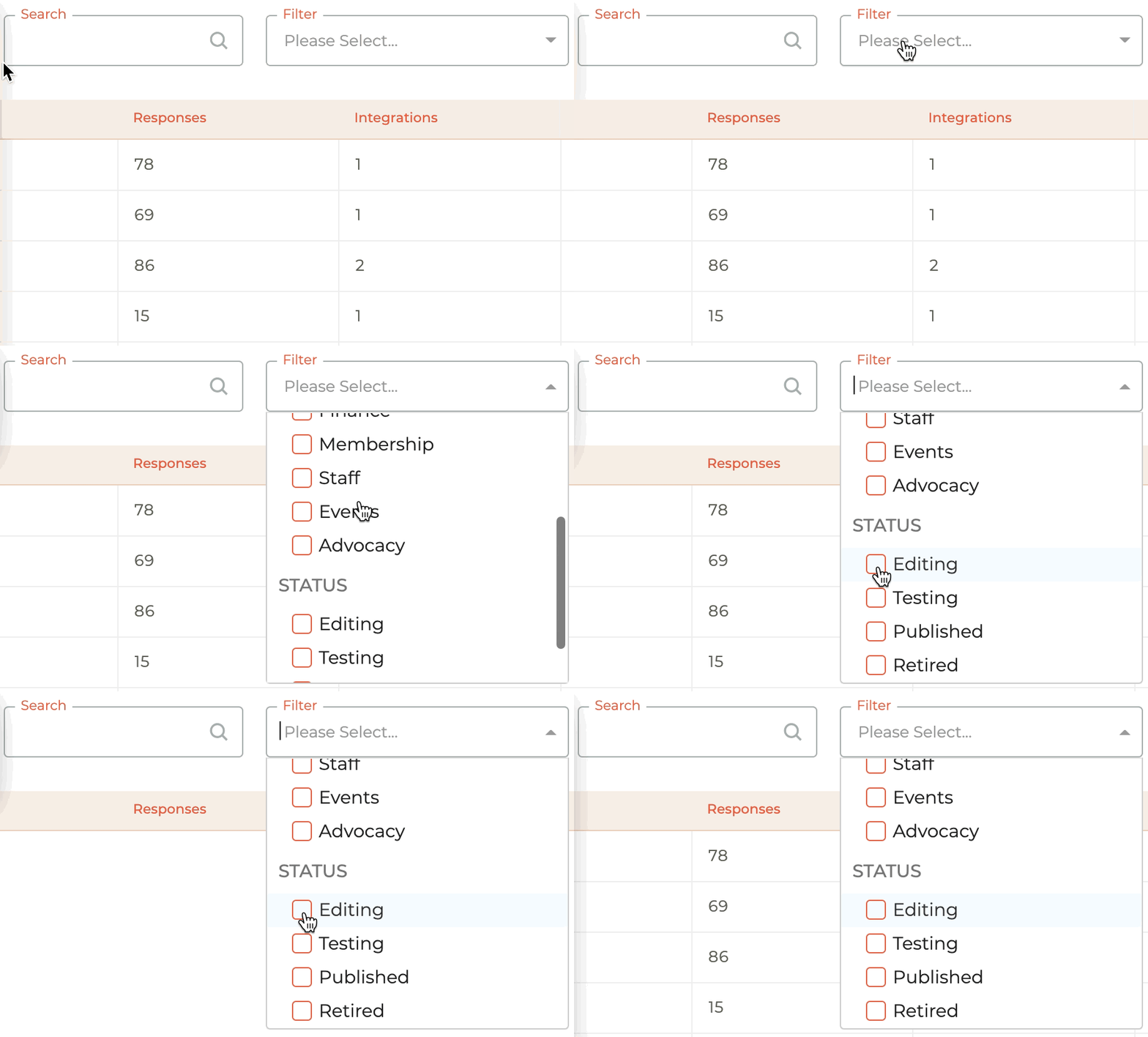
You may do a free form search, filter by category (defined by association), Status (Editing, Testing, Published, or Retired), or add a new form by clicking the - - icon on the top right side of the page.
¶ Individual Forms Dashboard
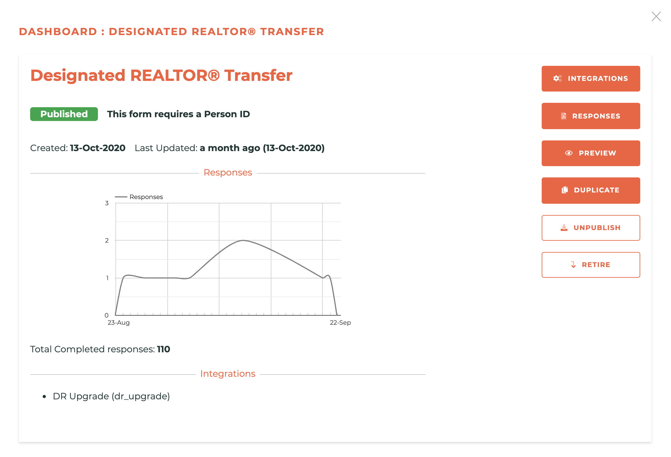
The individual form dashboard is designed to give you insight into the following pieces of information:
Form Name: Shows the name of the form.
Status: (Editing, Published or Retired) Shows status, whether or not the form requires a Person ID, and determines available menu options.
Date Created: Shows date the form was created.
Last Updated: Shows the date the form was last updated.
Responses Chart & Total Responses Count: Shows a graph of the last thirty days of response activity and the total response in the form's history.
Integrations: Lists the integrations already applied to the form.
¶ "Editing" Menu Options
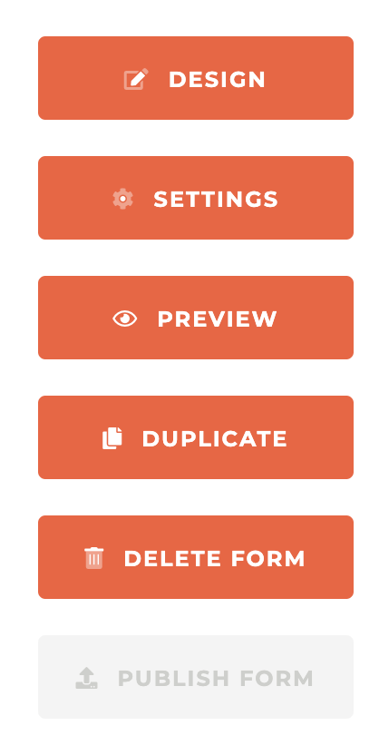
When a form is in the "Editing" status, the following menu options ara available: Design, Settings, Preview, Duplicate, and Delete Form.
¶ Individual Form Menu Options
¶ "Published" Menu Options
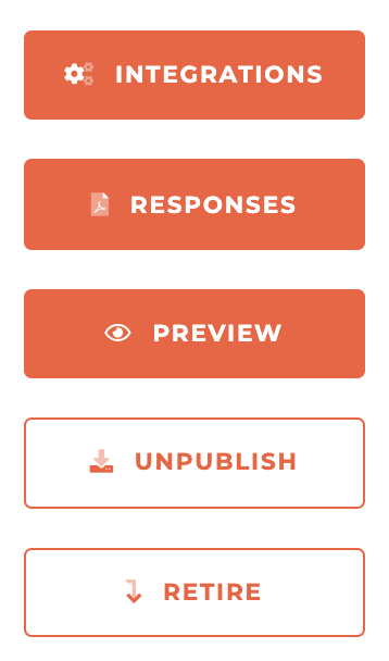
When a form is in the "Published" status, the following menu options ara available: Integrations, Responses, Preview, Unpublish and Retire.
¶ "Retired" Menu Options
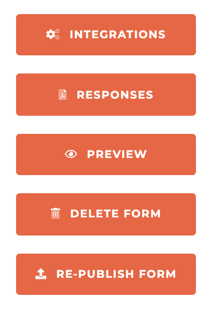
When a form is in the "Retired" status, the following menu options ara available: Integrations, Responses, Preview, Delete Form and Re-Publish Form.
¶ Adding (Creating) A New Form
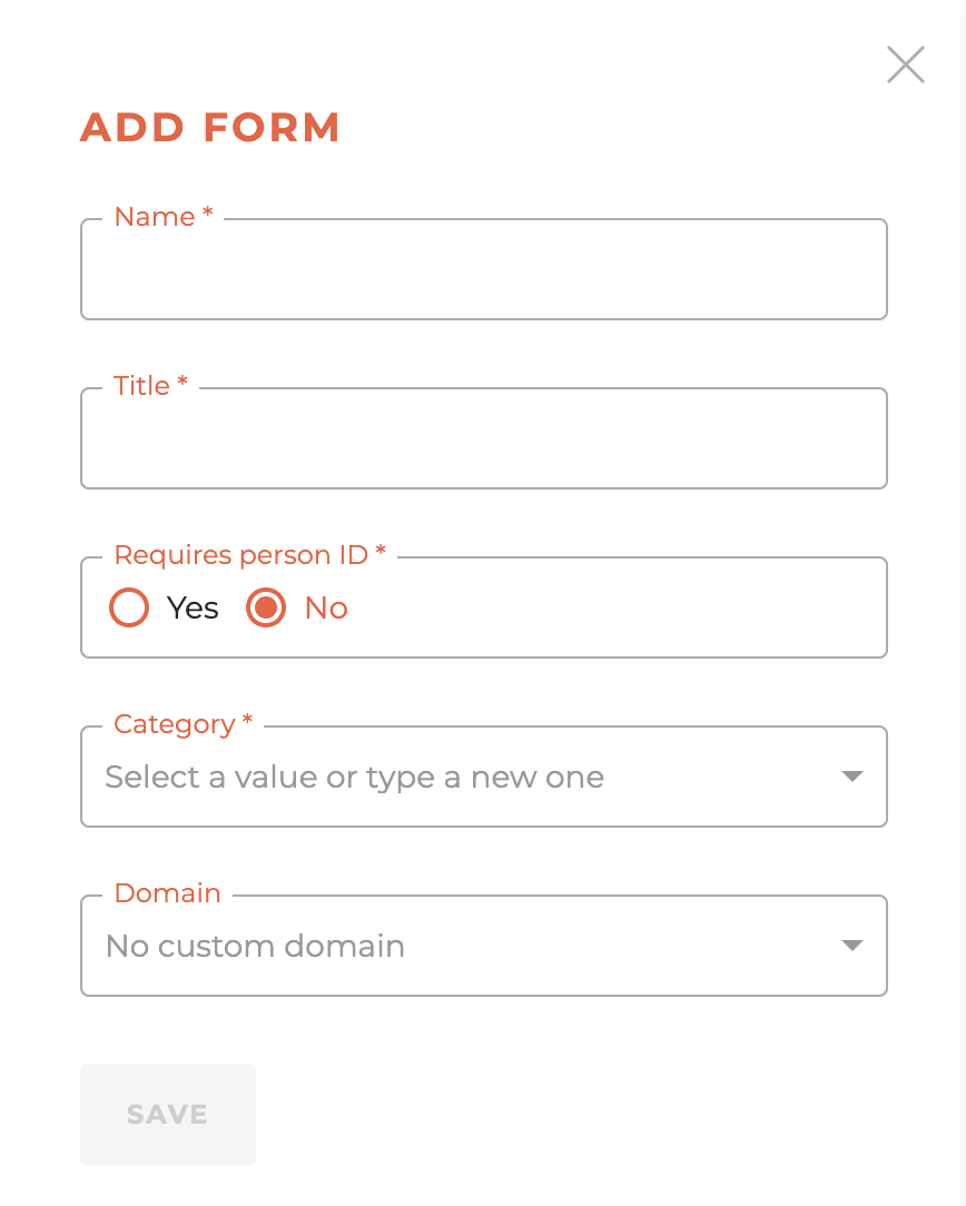
With the appropriate rights enabled, when you click on the orange - - icon, you will be taken to an add form screen in the right side bar that will allow you to create a new form. Many "Simple" & "Complex" forms will be able to be easily created by staff without the assistance of Tangilla staff. Some forms of "Complex" forms, however, may always require Tangilla Staff assistance to ensure custom coding is in place and special integrations are properly enabled. That said, most forms you will need to created can and should be created in the Forms module inside of Tangilla.
Once you click save, you will be taken directly into the form designer space.
¶ Name and Title
The "Name" of the form is what appears to you as staff and the "Title" of the form is what appears to the person who is accessing the form.
¶ Requires A Person ID
The "Requires A Person ID" field determines whether someone needs to be logged into their Member Portal to fill out the form. If you choose "Yes," then the form MUST be turned into a Portal Form to be filled out. If you choose "No," then the form can be linked to publicly, and anyone may fill out the form.
¶ Category
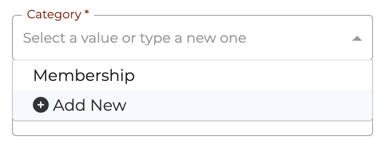
The Category field is a required field. If you do not see a category that matches the form you are creating, click on "Add New" and type in the name of the new category. It will be created upon saving.
¶ Domain
The Domain field is NOT a required field. Unless you need a special domain to host forms, just leave this empty.
¶ Designing A Form

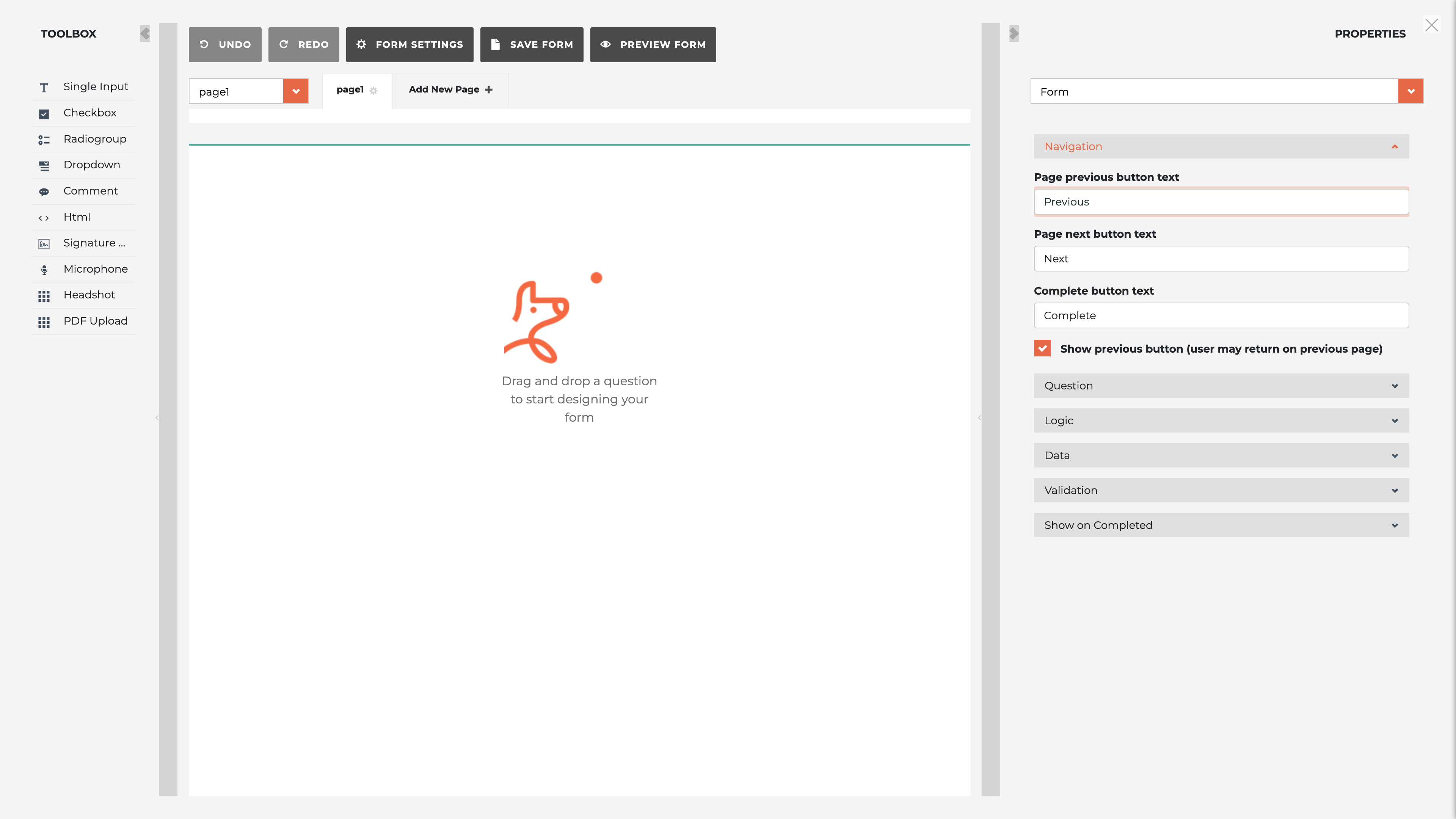
Upon creation of a form, you are immediately taken into the design space. However you may get back to the design space at any time in the creation process by clicking on the Design button in the "Editing" menu. This will cause your entire computer screen to be taken over by the forms design window.
¶ The Toolbox
On the left-hand side of the design space is the "Toolbox" panel. The toolbox panel contains the different elements that can make up a form. This includes single input questions, checkboxes, radiogroups, dropdowns, comments, html and signature capture boxes, state license validation, microphone input, headshots (images) and PDF upload options.
¶ Single Input
This option allows you to add a single-line text input field to your survey. It’s suitable for short, open-ended responses such as names, addresses, or other brief information.
¶ Checkbox
This option allows you to add a checkbox question, which lets respondents select multiple answers from a list of options.
¶ Radiogroup
This option allows you to add a radio button question, where respondents can select only one answer from a list of options.
¶ Dropdown
This option allows you to add a dropdown list question, which is similar to a radiogroup but uses a dropdown menu to save space.
¶ Comment
This option allows you to add a multi-line text input field for longer, open-ended responses. It’s suitable for comments or detailed feedback.
¶ Html
This option allows you to add custom HTML content to your survey. It can be used for adding instructions, images, or any other HTML content.
¶ Signature Pad
This option allows you to add a signature pad to your survey, enabling respondents to provide a digital signature.
¶ State Licence Validation
This option allows you to add a state license validation field, which can be used to validate real estate licenses against the contect contained in the Tangilla license database for each State.
¶ Microphone
This option allows you to add a microphone input to your survey, enabling respondents to provide audio responses.
¶ Headshot
This option allows you to add a headshot capture field, enabling respondents to upload or capture a photo of themselves.
¶ PDF Upload
This option allows you to add a file upload field specifically for PDF documents, enabling respondents to upload PDF files.
¶ Form Setting Properties
¶ Navigation
The "Navigation" section allows you to customize the text and functionality of the navigation buttons that respondents use to move through the survey. Here’s an explanation of each field:
¶ Page Previous Button Text
This field allows you to specify the text that will appear on the button used to navigate to the previous page of the survey.
¶ Page Next Button Text
This field allows you to specify the text that will appear on the button used to navigate to the next page of the survey.
¶ Complete Button Text
This field allows you to specify the text that will appear on the button used to complete the survey.
¶ Show Previous Button (user may return on previous page)
This checkbox allows you to control whether the "Previous" button is shown, enabling respondents to navigate back to previous pages in the survey. If checked, respondents can return to earlier pages to review or change their answers.
¶ Question
The "Question" section allows you to customize various aspects of how individual questions are displayed and validated. Here’s an explanation of each field:
¶ Question Description Location
This field specifies where the description text for a question will be displayed. The options typically include:
- under title: The description is displayed directly below the question title.
- under input: The description is displayed below the input field.
- default: The description is displayed in the default location as specified by the survey theme or settings.
¶ Show Question Numbers
This field allows you to control whether question numbers are shown in the survey. The options include:
- on: Display question numbers.
- off: Do not display question numbers.
- onPage: Display question numbers relative to the page. Every new page willl start question numbers over at 1.
¶ Question Error Location
This field specifies where the error messages for a question will be displayed when validation fails. The options typically include:
- top: Display error messages above the question.
- bottom: Display error messages below the question.
- under input: Display error messages directly under the input field.
¶ Max Text Length
This field sets the maximum number of characters allowed in a text input field for a question. A value of 0 means there is no limit.
¶ Max Others Length
This field sets the maximum number of characters allowed in the "Other" choice text input field for questions that include an "Other" option. A value of 0 means there is no limit.
¶ Logic
The "Logic" section allows you to add and configure logic elements that control the behavior of the survey based on the respondents' answers. Here’s an explanation of each field:
¶ Calculated Values
This option allows you to define values that are calculated based on the answers to other questions. These values are dynamically updated as respondents answer the survey.
- Example Usage: To add a new calculated value, click "ADD NEW." You can then define the name of the calculated value and the expression used to calculate it.
¶ Triggers
This option allows you to define actions (triggers) that occur based on specific conditions in the survey. Triggers can be used to set values, show/hide questions, navigate to a different page, or complete the survey based on respondents' answers.
- Example Usage: To add a new trigger, click the "+" button next to "Add a new item." You can then select the type of trigger and configure its settings.
Types of Triggers:
- Set Value Trigger: Sets a value for a question based on an expression.
- Visible Trigger: Shows or hides a question or panel based on an expression.
- Complete Trigger: Completes the survey if the condition is met.
- Skip Trigger: Skips to a specific question or page if the condition is met.
¶ Data
The "Data" section fields shown in the screenshot provide options to control how the survey data is handled, particularly regarding invisible values and responses to "Other" options. Here’s an explanation of each field:
¶ Clear Invisible Values
This dropdown allows you to specify when to clear the values of questions that are not currently visible to the respondent. Invisible values are responses to questions that have been hidden based on the survey logic (e.g., conditional visibility).
Options:
- none: Invisible values are never cleared.
- onHidden: Clear the values immediately when the question becomes invisible.
- onComplete: Clear the values when the survey is completed.
- onHiddenContainer: Clear values when the container (panel or page) containing the question becomes invisible.
¶ Store 'others' value in separate field
When this checkbox is checked, the value entered by the respondent for an "Other" option is stored in a separate field instead of being combined with the selected option. This can help in clearly distinguishing between predefined options and custom responses provided by respondents.
- Example: If a respondent selects "Other" and specifies "Blue" as their favorite color, this option ensures that "Other" is recorded as the choice and "Blue" is stored in a separate field.
¶ Validation
The "Focus on first error" option under the "Validation" section ensures that when a respondent tries to proceed with the survey and there are validation errors, the focus will automatically move to the first question with an error. This helps improve the user experience by immediately drawing attention to the specific issue that needs to be addressed, allowing respondents to quickly identify and correct their mistakes.
¶ Focus on First Error:
Checkbox: When checked, this feature ensures that the first validation error in the survey will be focused on, bringing the respondent's attention directly to the question that needs correction.
- Example Use Case: If a respondent tries to submit a page but has left a required field blank or entered an invalid response, the survey will automatically scroll to and highlight the first question with the error, allowing the respondent to address it immediately.
¶ Show On Completed
The "Show on Completion" section provides options for configuring what respondents see upon completing the survey. Here’s an explanation of each field:
¶ Navigate to URL
This field allows you to specify a URL to which respondents will be redirected after completing the survey. This can be useful for directing respondents to another webpage, a thank-you page, or any other URL.
¶ Show the Completed Page at the End (completedHtml)
This checkbox, when checked, ensures that a specific "Completed" page is shown at the end of the survey. You can customize the content of this page using HTML.
¶ Completed HTML
This field allows you to specify the HTML content that will be displayed on the "Completed" page if the above checkbox is checked. This content is shown to respondents as a thank-you message or any other information you want to display upon survey completion.
¶ Navigate to URL on Condition
This section allows you to define conditional logic for redirecting respondents to different URLs based on their responses. You can add multiple conditions and specify different URLs for each condition.
¶ Completed HTML on Condition
This section allows you to define different HTML content to be displayed on the "Completed" page based on specific conditions. You can add multiple conditions and specify different HTML content for each condition.
¶ Loading HTML
This field allows you to specify the HTML content that will be displayed while the survey is loading. This can be used to provide a loading message or any other content to be shown during the initial loading phase of the survey.
¶ Completed Before HTML
This field allows you to specify the HTML content that will be displayed if the respondent has already completed the survey. This helps inform the respondent that they have previously submitted their responses.
¶ Form Input Properties
On the right-hand side of the design space is the "Properties" panel. The properties panel contains the various options available for each element type and is configured individually. The properties for each element change dynamically and are where the real power of Tangilla forms comes from.
¶ General
These options allow you to customize the appearance and behavior of your survey questions to better fit your survey’s needs. Here’s an explanation of each field:
¶ Name
This field specifies the unique identifier for the question within the survey. It is used for referencing the question in expressions, data binding, and survey logic.
¶ Title
This field specifies the label or question text that will be displayed to the respondents. If left empty, the "name" value will be used as the title.
¶ Description
This field allows you to provide additional information or instructions about the question. The description will be displayed below the question title.
¶ Is Visible?
This toggle controls whether the question is visible to respondents. If turned off, the question will be hidden.
¶ Is Required?
This toggle controls whether the question is mandatory. If turned on, respondents must answer the question before they can complete the survey.
¶ Read Only
This toggle controls whether the question is editable. If turned on, respondents can view but not modify the question.
¶ Input Type
This allows you to specify the type of input that a text question will accept. This is based on HTML5 input types, and each type tailors the user input experience to fit the kind of data being collected. Here is a description of each input type available in the dropdown list:
- Input Types
-- color: Displays a color picker to the user. Suitable for selecting a color value.
-- date: Provides a date picker.Suitable for selecting a specific date (e.g., birth date).
-- datetime-local:Allows the user to select both date and time, without a timezone.Useful for scheduling events in the user's local time.
-- email: Restricts input to a valid email address format.Suitable for collecting email addresses.
-- month: Provides a dropdown to select a month and year.Useful for date ranges or billing cycles.
-- number: Restricts input to numeric values.Suitable for quantities, measurements, and other numeric data.
-- password: Hides input text for sensitive information like passwords. Used for collecting passwords or other sensitive information.
-- range: Displays a slider control for selecting a value within a range.Useful for ratings or selecting values within a bounded range.
-- tel: Optimizes input for telephone numbers.Suitable for collecting phone numbers.
-- text: Default input type for general text.Suitable for any text input.
-- time: Allows the user to select a time (hours and minutes).Suitable for scheduling events.
-- url: Restricts input to a valid URL format. Suitable for collecting web addresses.
-- week: Provides a dropdown to select a specific week of the year. Useful for date ranges related to weeks.
¶ Allow Clear
This option, specific to input fields like the signature pad, allows respondents to clear their input. For example, in the case of a signature pad, it would allow respondents to clear their signature and start over.
¶ Pen Color
This option allows you to set the color of the pen for input fields that support drawing, such as the signature pad. You can specify the color in a format like hexadecimal, RGB, or color name.
¶ Tangilla
¶ Mapped Field
This field allows you to specify which field in Tangilla the survey response should be mapped to. This ensures that the data collected in the survey is correctly associated with the corresponding data field in Tangilla’s database.
- Example: If you are collecting the last name in the survey, you might map it to Tangilla’s
LastNamefield.
Available Tangilla Fields For Mapping: FirstName, LastName, FullName, PreferredName, emailaddress, Phone, Office, Role, LicenseNumber, LocalAssociation, memberNRDS, officeNRDS, officeMLSID, LocalAssociationName, home_street_1, home_street_2, home_city, home_zip, home_full_address, office_street_1, office_street_2, office_city, office_zip, and office_full_address.
¶ Identifying Question
When checked, this option marks the question as an identifying question. This means that the question is used to uniquely identify the respondent within Tangilla. It is essential for ensuring that each set of responses can be traced back to a specific individual.
- Example: You might mark a unique membership ID or email address as an identifying question to ensure that responses are correctly associated with individual members.
¶ Include in Output
When checked, this option ensures that the response to this question is included in the survey output. This is important for reporting and data analysis, as it allows you to specify which questions’ responses should be part of the exported data.
- Example: For critical data like membership status or contact information, you would include these in the output to have them available in reports.
¶ Report Label
This field allows you to specify a custom label for the question when it appears in reports. This can help make the reports more readable and easier to understand by using familiar terms or concise labels.
- Example: Instead of using the technical field name
LastName, you might use a more user-friendly label likeMember Last Name.
¶ Input Mask
This field allows you to specify an input mask for the question. An input mask is a string of characters that indicates the expected format of the input. It helps guide respondents to enter data in the correct format and can improve data consistency.
- Example: For a phone number field, you might use an input mask like
(999) 999-9999to ensure the number is entered in the proper format.
¶ Input Format
This field allows you to specify the format for the input data. It helps ensure that the data is consistent and properly formatted when stored in Tangilla. This can be particularly important for dates, numbers, and other standardized data types.
- Example: For a date field, you might specify a format like
YYYY-MM-DDto ensure all dates are entered consistently.
¶ Choices From Web
This section allows you to dynamically load choices for a dropdown, checkbox, or radiogroup question from a web service. Here’s an explanation of each field:
¶ URL
This field specifies the endpoint of the web service from which the choices will be fetched. The URL should point to a service that returns a list of items in a format compatible with SurveyJS.
¶ Path
This field specifies the JSON path within the web service response where the list of choices can be found. This is useful when the response contains nested objects and you need to specify the exact location of the choices.
¶ Value Name
This field specifies the name of the property in the web service response that contains the value for each choice. The value is what will be stored in the survey results when a choice is selected.
¶ Title Name
This field specifies the name of the property in the web service response that contains the display text for each choice. The title is what will be shown to the respondents.
¶ Allow Empty Response
This checkbox allows you to specify whether an empty response from the web service is acceptable. If checked, the question can be displayed even if the web service returns no choices.
¶ Test the Service
This button allows you to test the web service configuration. When clicked, it will make a request to the specified URL and display the response. This helps verify that the service is returning the expected data.
¶ Dropdown (Select...)
This dropdown shows the current choices fetched from the web service. Once the web service is tested and the choices are loaded, they will be displayed here for selection.
¶ Logic
These options allow you to create dynamic and responsive surveys that adapt to the input provided by respondents, making the survey experience more personalized and relevant. Depending on your question/input type, not all of these options will be available. Here’s an explanation of each field:
¶ Visible If
This option allows you to control the visibility of a question, panel, or page based on an expression. If the expression evaluates to true, the element will be visible; otherwise, it will be hidden.
¶ Enable If
This option allows you to enable or disable a question based on an expression. If the expression evaluates to true, the element will be enabled; otherwise, it will be disabled (visible but not interactive).
¶ Required If
This option makes a question required based on an expression. If the expression evaluates to true, the question becomes required; otherwise, it is not required.
¶ Default Value Expression
This option allows you to set a default value for a question based on an expression. The expression is evaluated when the survey is rendered, and the result is used as the default value for the question.
¶ Hide If Choices Empty
This option allows you to hide a question if its choices are empty. This can be useful for questions that rely on dynamic choice lists, ensuring they are only shown when there are available options.
¶ Choices Visible If
This option allows you to control the visibility of specific choices within a question based on an expression. If the expression evaluates to true, the choice will be visible; otherwise, it will be hidden.
¶ Choices Enable If
This option allows you to enable or disable specific choices within a question based on an expression. If the expression evaluates to true, the choice will be enabled; otherwise, it will be disabled (visible but not selectable).
¶ Layout
The Layout section allows you to control the appearance and positioning of a survey question. Here’s an explanation of each field:
¶ Is start with new line?
This checkbox determines whether the question should start on a new line. If checked, the question will be placed on a new line, separate from any preceding elements. When unchecked, it moves the question up beside the previous question.
¶ Description Location
This field specifies where the description text of the question should be displayed. The location can typically be set to options like "underInput", "underTitle", "default", etc.
¶ Indent
This field sets the indentation level of the question. It allows you to control the horizontal alignment of the question relative to other elements.
¶ Width
This field specifies the width of the question element. It can be set using any valid CSS width value (e.g., "300px", "50%", etc.).
¶ Min Width
This field sets the minimum width of the question element. It ensures that the question does not shrink below the specified width.
¶ Max Width
This field sets the maximum width of the question element. It ensures that the question does not grow beyond the specified width.
¶ Column Count
This field allows you to specify the number of columns the question should span. This is useful for creating multi-column layouts within the survey.
¶ Data
The "Data" section allow you to configure how the data for a particular question is handled. Here’s an explanation of each field:
¶ Value Name
This field specifies the name of the value in the survey results that corresponds to this question. This name is used when accessing the question’s response programmatically or in the survey results.
¶ Default Value
This field allows you to set a default value for the question. This value will be pre-filled in the question when the survey is first loaded. It can be useful for providing a starting point or suggested answer.
¶ RESET Button
This button allows you to reset the question to its default value. When clicked, any user input will be cleared, and the default value (if set) will be restored.
¶ REFRESH Button
This button allows you to refresh the question’s value. It re-evaluates any expressions or conditions tied to the default value, which can be useful if the default value depends on other dynamic inputs.
¶ Text Update Mode
the "Text update mode" setting controls when the survey updates the value of text questions. This setting affects how frequently and at what point the survey captures and processes the text input provided by respondents. Here’s an explanation of each option:
-
default: In the default mode, the text value is updated based on the survey’s default settings, which might typically be when the input loses focus (onBlur) or when the survey is submitted. This mode relies on the predefined behavior set by SurveyJS.
-
onBlur: In the onBlur mode, the text value is updated when the input field loses focus. This means that the survey will capture and process the text input when the respondent clicks or tabs out of the text field. Example: If a respondent types their name in a text field and then clicks on another field or outside the input box, the survey will update the value at that moment.
-
onTyping: In the onTyping mode, the text value is updated continuously as the respondent types. This means that every keystroke will trigger an update, capturing and processing the input in real-time. Example: As a respondent types their name, the survey will update the value with each character typed, providing immediate feedback and capturing the most current input.
Use Cases and Impact
- default: This is a flexible choice that adapts to the survey's overall settings and is suitable for most scenarios where the default behavior is sufficient.
- onBlur: This option is ideal when you want to minimize the number of updates to reduce processing load or when the final input value is more important than the intermediate values.
- onTyping: This is useful for scenarios where real-time validation or feedback is necessary, such as showing suggestions, validating input on-the-fly, or updating other elements based on the input.
¶ Validation
The "Validation" section allows you to configure validation rules and error messages for a survey question. Here’s an explanation of each field:
¶ Required Error Text
This field allows you to specify a custom error message that will be displayed if the respondent fails to answer a required question. This message provides feedback to the user, indicating that they need to provide a response.
¶ Validators
This section allows you to add various validators to the question. Validators are used to ensure that the response meets certain criteria. SurveyJS supports several types of validators, including:
- Expression: Validates the answer using a custom expression.
- Email: Ensures the answer is a valid email address.
- Numeric: Ensures the answer is a number and can have min/max values.
- Regex: Validates the answer against a regular expression.
- Text: Ensures the answer meets specific text criteria, such as min/max length.
Adding a Validator:
To add a new validator, click the "+" button next to "Add a new item." You can then select the type of validator and configure its settings.
¶ Previewing A Form

You can preview a form at any time by clicking on the - - Preview Button. If the form requires no Personal ID, it will open in a window with an option to proceed with or without validation. Form previews NEVER result in an official form response. They are designed to allow you to quickly test for functions.
The default preview mode is "Preview Mode (no validation)" which can be switched to "Preview Mode (with validation)." When previewing with "no validation," you can advance the form without needing to provide valid information. When previewing "with validation," you can test validation as part of your preview process.
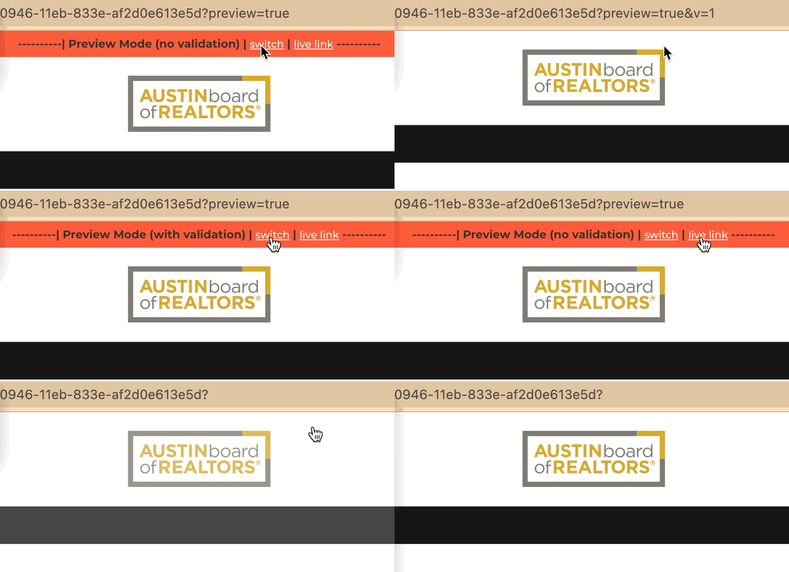
You may switch between validation options by clicking on the "switch" link at the top of the form preview. The "live link" takes you to the form link that will allow official submission of the form responses.
¶ Previewing A Form Requiring Personal ID
If a form requires a PID and you choose to preview, you will first be asked to find a member record to preview the form properly. You will do this in the search windo that will slide out from the right side of the screen.

¶ Form Settings

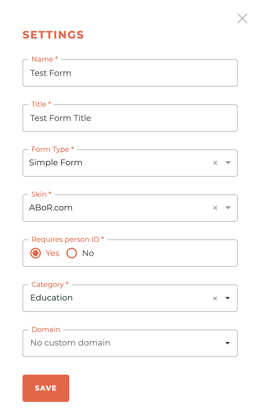
You can only access the - - Settings button when a form is in the "editing" status. This is where you Name the form, give it a Title, determine it's Form Type (simple or complex), choose the design "Skin," determine whether it will require a Person ID, choose a Category (association specific) and Domain (association specific). These can be changed at any time while the form is in the Editing state.
¶ Duplicating A Form

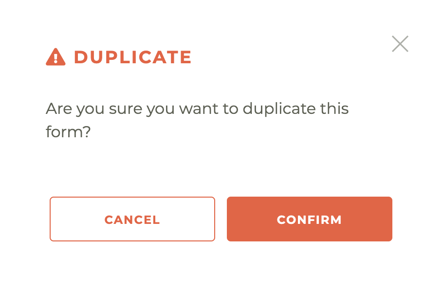
You may duplicate any form to make the creation of a similar form simpler. To do this, click on the. - - Duplicate Button for any form you wish to duplicate. This will cause the following warning to pop up. Once you have hit confirm, a copy of the form is created and will be in the Editing status.
¶ Deleting A Form

Only forms in the "Editing" or "Retired" status can be deleted. To Delete a form, click on the - - Delet Form Button. This will cause a warning box with the following message to pop up: Permanently delete this form? You cannot undo this.
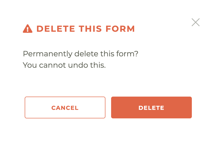
Please note: This action can't be undone, not even by Tangilla Staff.
¶ Publishing A Form

To publish a form, click on the Publish Form Button. This will cause a warning box with the following message to pop up: "Are you sure you want to publish this form? You will not be able to edit it once published."
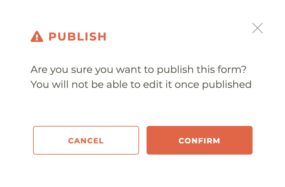
Please note: You will not be able to edit it once published. Unpublishing a form deletes all responses!
¶ Un-Publishing A Form

This is not an action you will want to take lightly. To Un-Publish a form, click on the - - Un-Publish Form button. This will cause a warning to pop up with the following message: Are you sure you want to UNPUBLISH this form? By selecting CONFIRM, all Responses to this form will be PERMANENTLY DELETED.
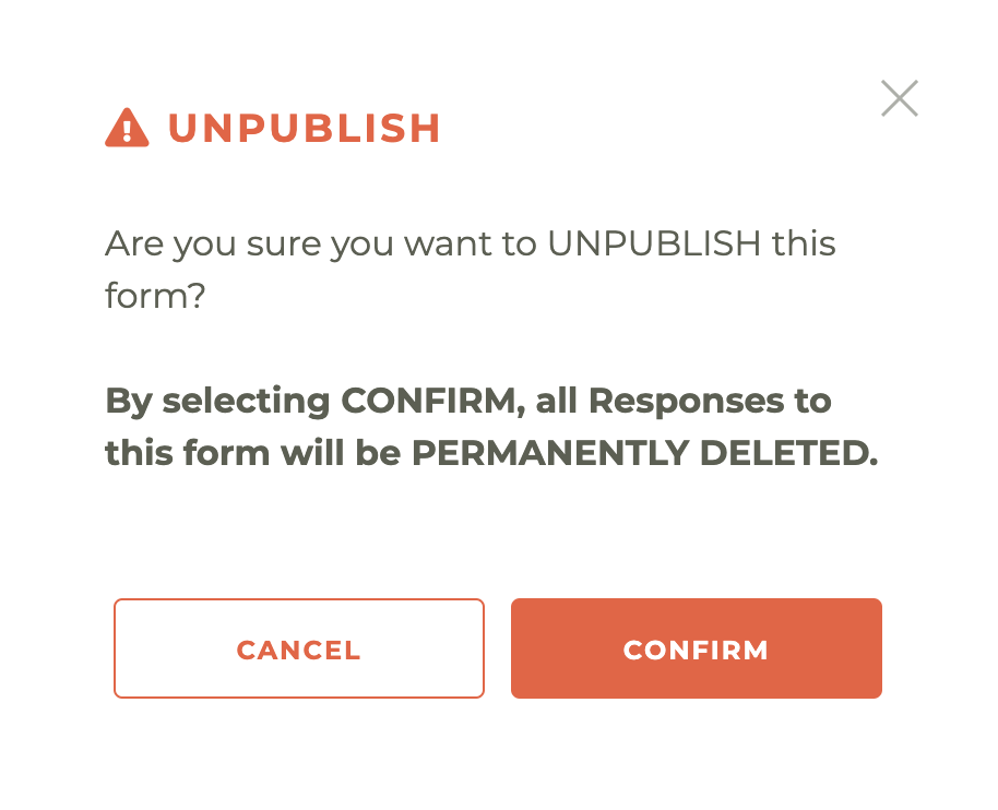
Please note: You will not be able to edit it once published. Unpublishing a form deletes all responses! Let us say that again, By selecting CONFIRM, all Responses to this form will be PERMANENTLY DELETED.
¶ Retiring A Form

This is not an action you will want to take lightly. To Retire a form, click on the - < - Retire button. This will cause a warning to pop up with the following message: Are you sure you want to retire this form? You will lose all submitted responses.
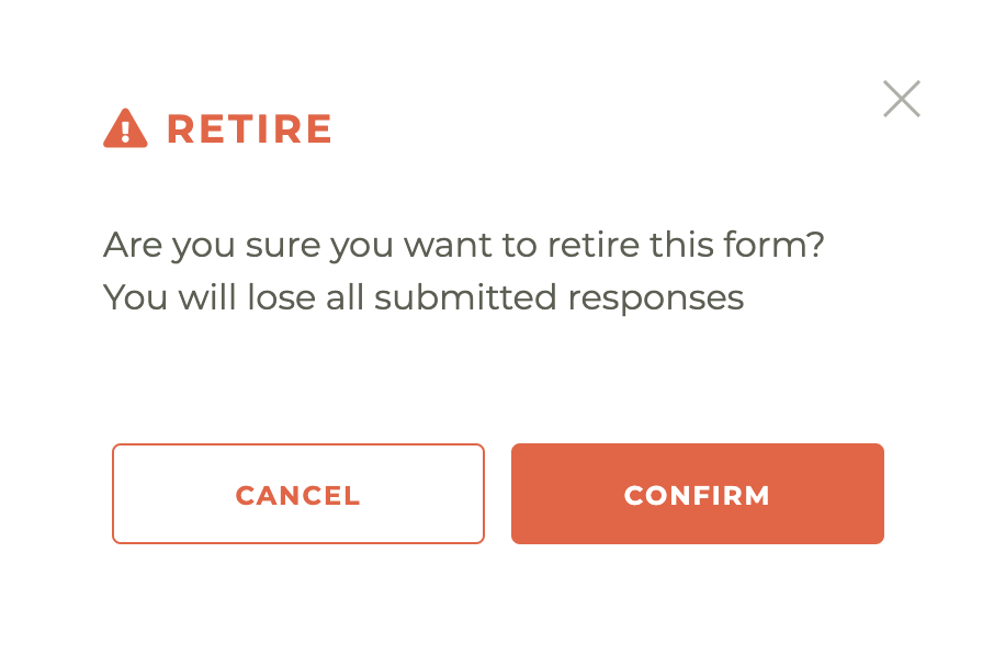
Please note: This action can't be undone, not even by Tangilla staff. You will lose all submitted responses upon hitting the confirm button.
¶ Re-Publishing A Form

There may be times when, after having retired a form that you may wish to Re-Publish the form. To do this, click on the - - Re-Publish Form button from the Retired Form Menu options. This will cause a warning box with the following message to pop up: "Are you sure you want to publish this form? You will not be able to edit it once published."

Please note: You will not be able to edit it once published. Unpublishing a form deletes all responses!
¶ Individual Form Responses

You may access any individual forms response by clicking on this page. Forms responses are organized by response date, but you can search using information contained in any field that is displayed on screen. The fields displayed are controlled by the form definition parameter "identifyingQuestion":true.

Clicking on will allow you to dowload a PDF of the completed form. Clicking on will allow you to see that specific response integration history, illustrated below. This will indicate the date and status of any executed integration.

Click on the icon and you will be taken to the system response associated with the individual form integration success or failure.

¶ Individual Form Integrations
Access to features in this area is dependent on your specific application privileges

This is accessed by clicking on the - - Integrations Button. You can see all of the integrations assigned to a specific form on this page. And take specific actions against any individual integration. Clicking the - - icon will take you to the integrations update screen. Clicking the - - icon will take you to the integrations history for this specific form. Clicking the - - icon will delete the associated integration.

¶ Adding An Integration
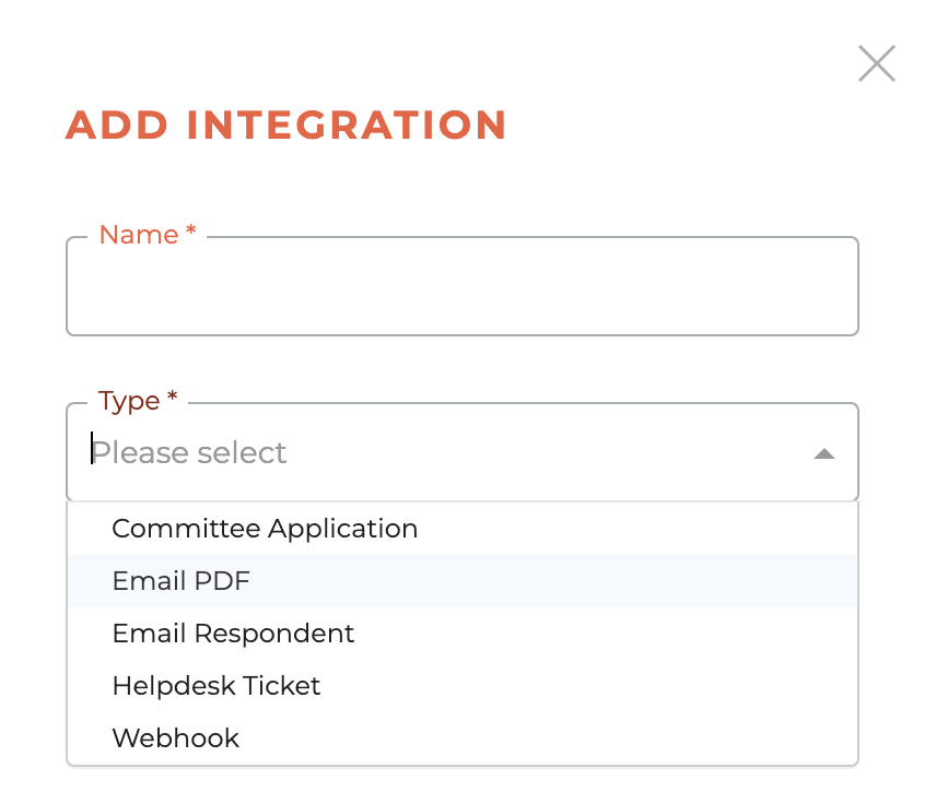
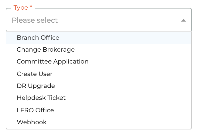
You can also add a new integration to a form by clicking on the orange - - icon in the upper right corner of this window. The available integrations are: Committee Application, Email PDF, Email Respondent, Helpdesk Ticket and Webhook. The added integration will be performed on the next completion of that specific form.
¶ Editing An Integration
Once an integration has been added to an individual form, it may be edited at any time by clicking on the - - icon.
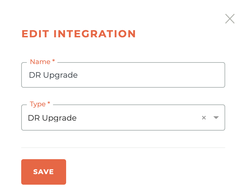
Options for editing will be contingent on the specific integration and the specific integrations that relate to your association.
¶ Deleting An Integration
An integration may be deleted at any time by clicking on the - - icon. This will cause the deletion warning window to pop up and you must confirm before deletion.
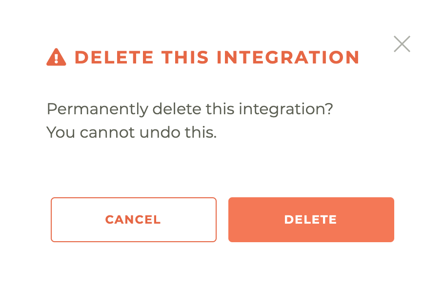
Please note: This action can't be undone, not even by Tangilla Staff, and could have a negative impact on future form completions. Do this only if you are certain this integration is no longer required for the successful completion of this form and the processes associated with it.
¶ Integration History
Click on the - - icon to see a history of the successful and/or failed integration attempts for that specific integration. The example below is for "DR Upgrade" inegration history. This window also provides a quick look at the status and you can easily see when a specific form is still "In Progress."

¶ Integration Responses
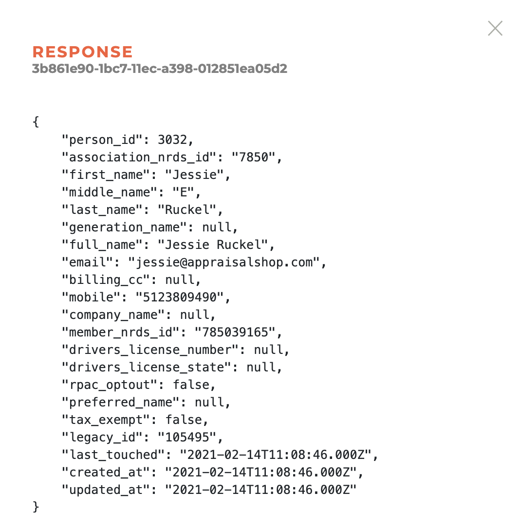
Clicking on the specific response ID or the - - icon will open up a window that will display the integration results. The following is an example of a "Completion Email" integration, that will show success or failure. Some response feedback will be more detailed than others.
¶ Viewing Files Uploaded In A Form
When you want to see files (PDF, PNG, JPG, etc) that may be uploaded as part of an application or form, you will need to run a Form Responses Report ( https://app.tangilla.com/reports/report-category/forms). The code to interpret and visualize those files resides inside the reporting module.

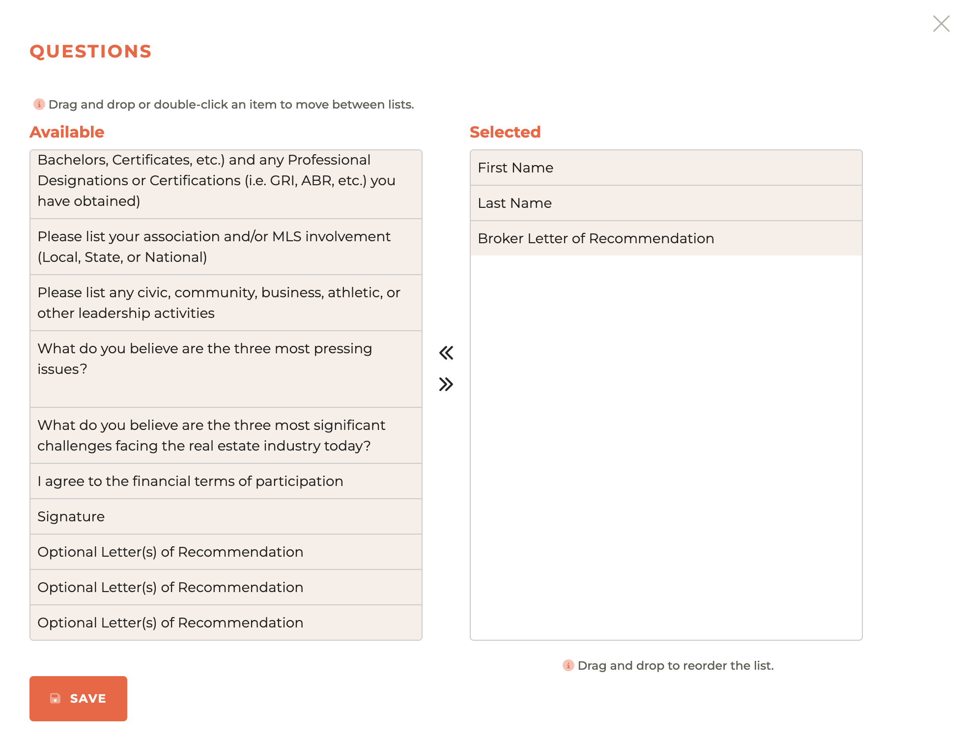
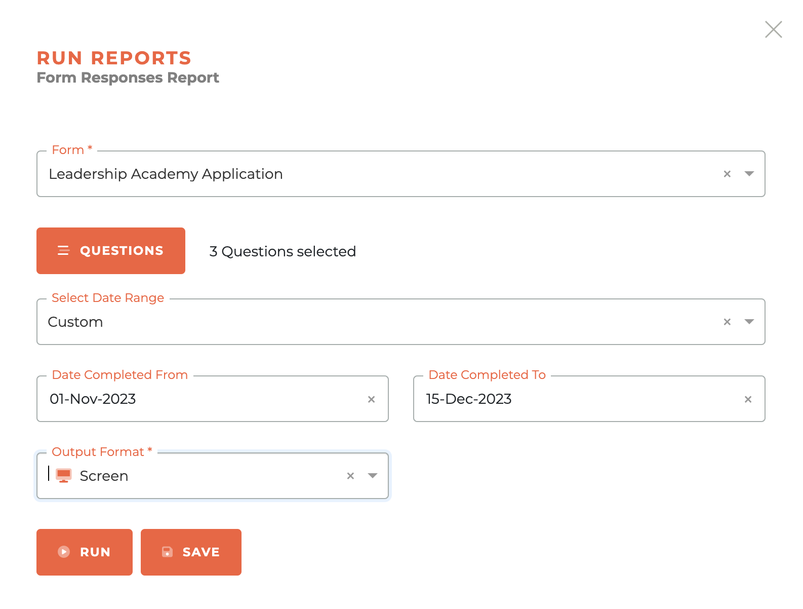
Choose the Form Responses Report, then choose the Form you wish to view. Once selected, make sure you include the questions that contain the file uploads.
Then choose the date range you wish to view and how you want to view it (CSV or Screen). You may also save the form selections for future use once satisfied.
You can then run the report to screen and you will be able to click on the "View File" button the uploaded file.

¶ Special Form Fields
There are a number of options for integrating data from Tangilla into your forms. Here are a few examples to help you get oriented.
¶ Active & Open Committee Selection
One of the most common questions we get asked is, "how do we create a Committee Application that ensures that applications flow into the Committees module for action." Once you've created your Committee Application in the Forms modue, this will require a couple of simple steps.
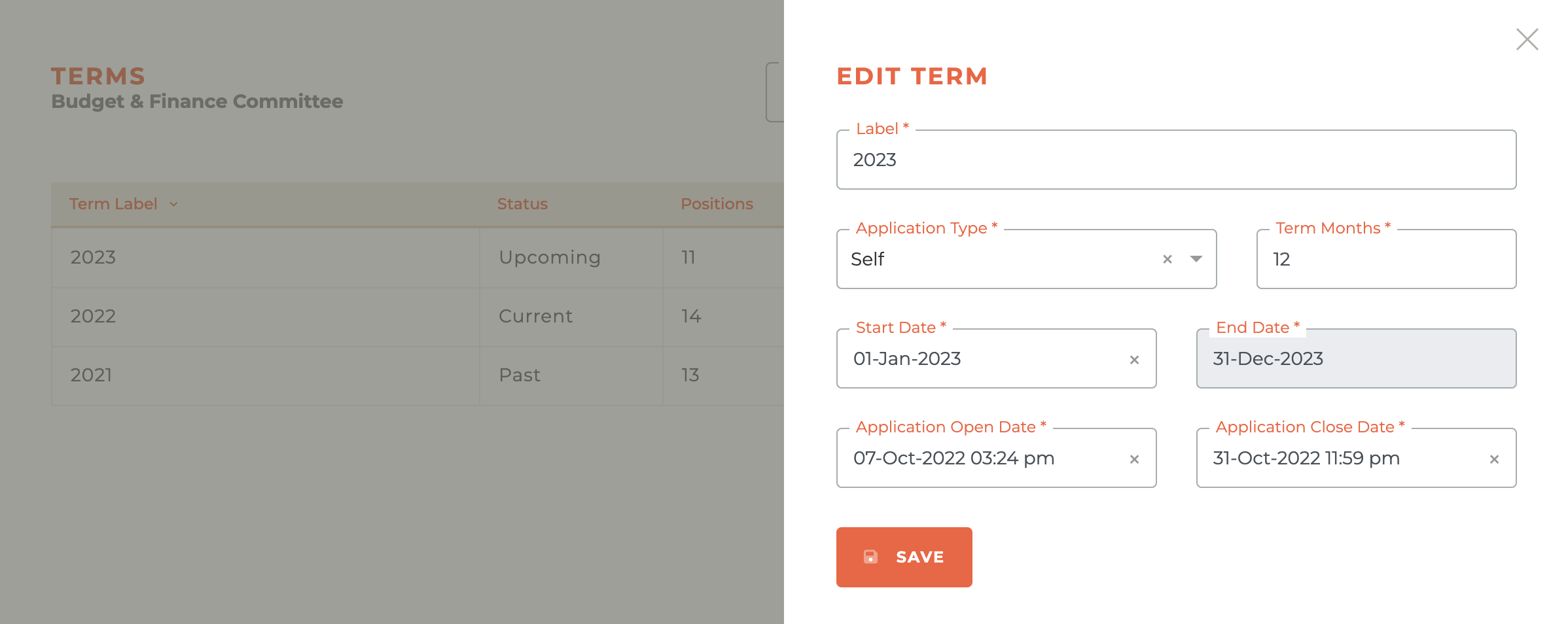
¶ Step 1: Make sure you have at least one Upcoming Committee Term that is open for accepting applications.

The term should be set to the "Self" Applications Type. And, if you want to be able to see the committee for selection in the form, the application open date must be prior to the time of your previewing.
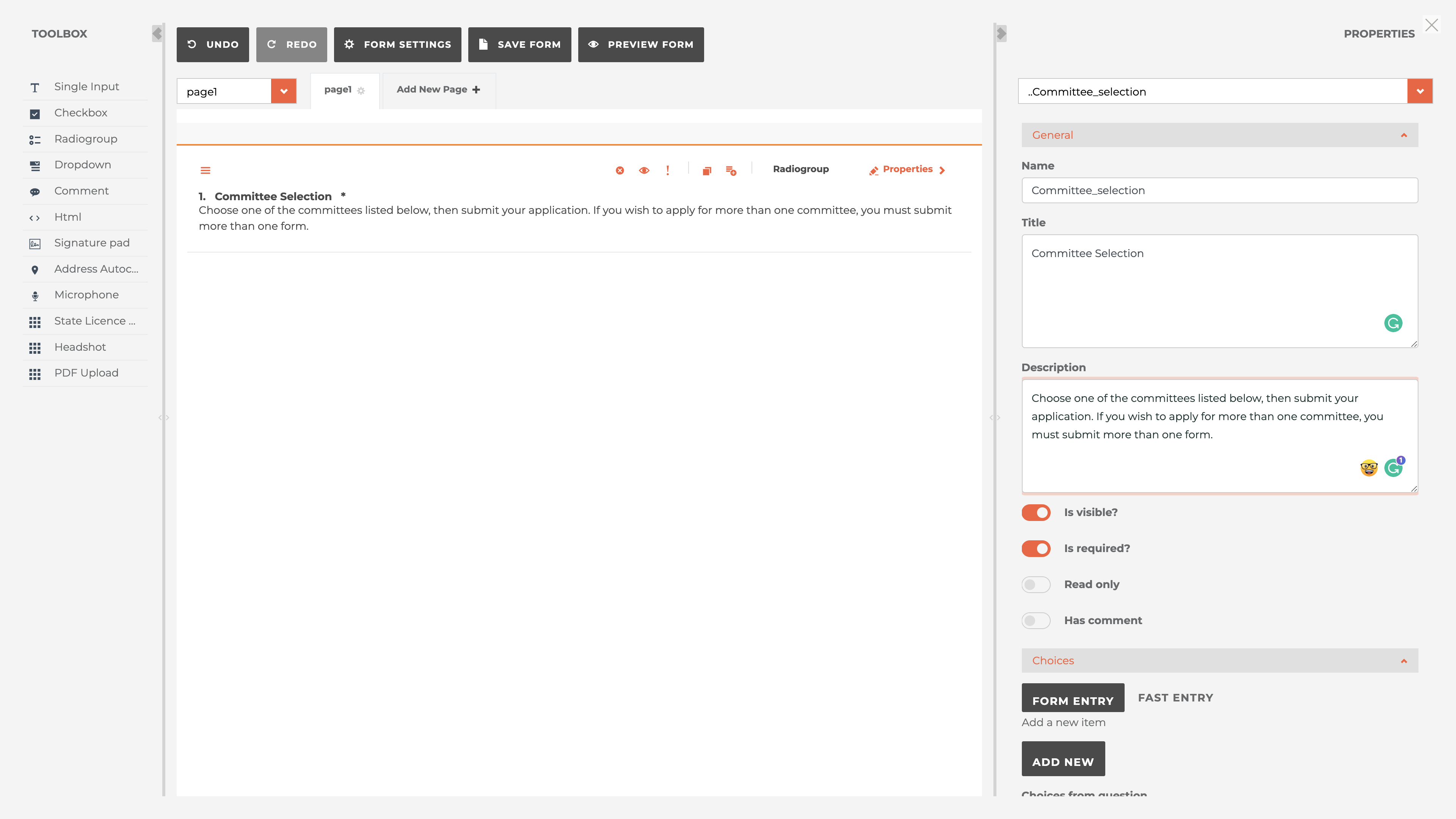
¶ Step 2: In the form, place a radiogroup field in the form and then delete all of the options for selection.
In the example below, a radiogroup field was placed in the form from the toolbox on the left hand side of the screen. Then, the "choices" were all removed and the "is visible" and "is required" options were selected. The name, title and description can be whatver you wish.
¶ Choose The CommitteeApplications Tangilla Option.
Once those choices are deleted, scroll downt he right hand menu to the "Tangilla" options.
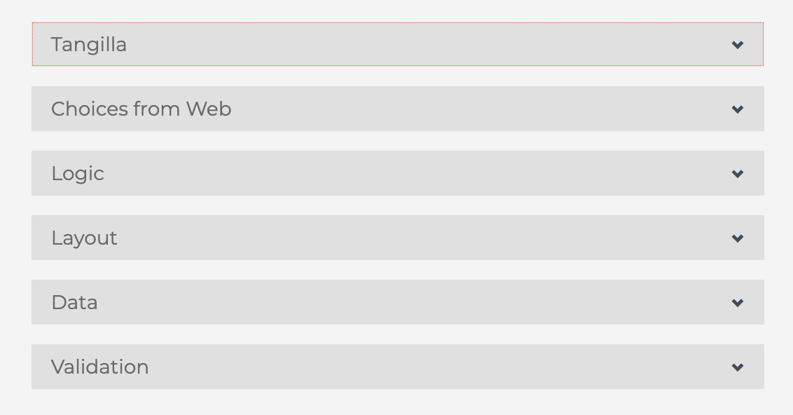
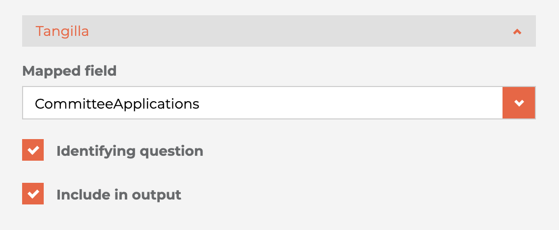
Click on the Tangilla option and select the "Mapped Field" called "CommitteeApplications." It should be the only option available to you. Make it an identifying question and include it in the output. This will then bring the description, term date and number of positions available into the selection options for this radiogroup button.
To preview the Committes available for selection, at least one Committee must have an upcoming and available term.
¶ Select Committee Integrations
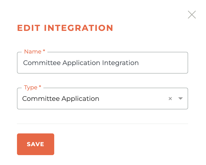
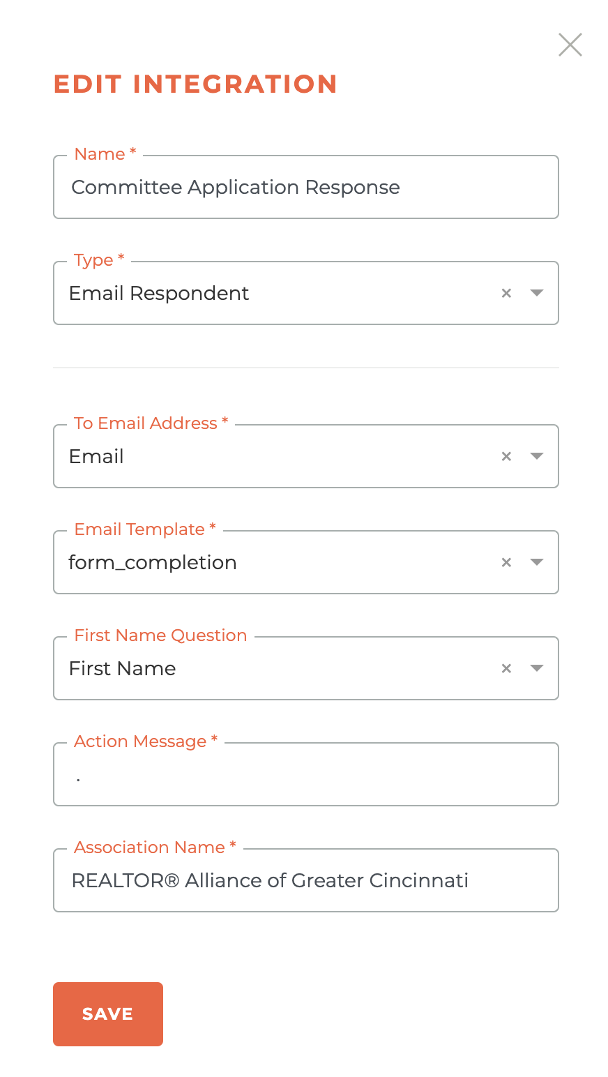
If you wish for the forms to appear in the Committees module under applications, you will need to add the "Committee Application" Integration. If you wish for the applicant to receive and email response signaling their proper completion, you will need to add the "Email Respondent" Integration.

¶ Committee Application Integration Settings
¶ Email Respondent Integration
¶ Frequently Asked Questions
| # | Question | Answer |
|---|---|---|
| 1 | What can I do on the Tangilla forms dashboard? | View your forms list, search, filter by category or status, and add a new form. |
| 2 | Which columns appear in the Forms List? | Form Name, Category, Form Type, Status, Responses, and Integrations. |
| 3 | How can I sort the Forms List? | By Form Name or Category. |
| 4 | Where do I see how many responses a form has? | The Forms List shows each form’s response count. |
| 5 | Where do I see how many integrations a form has? | The Forms List shows each form’s integration count. |
| 6 | How do I open the Individual Form Dashboard? | Click anywhere on a form’s row or the chart-line icon. |
| 7 | What search options are available? | Free-form search plus filters for category and status. |
| 8 | Which statuses can I filter by in search? | Editing, Testing, Published, or Retired. |
| 9 | How do I add a new form? | Click the orange plus-circle icon at the top-right. |
| 10 | What information does the Individual Form Dashboard show? | Form name, status (and PID requirement), date created, last updated, a 30-day responses chart with totals, and integrations. |
| 11 | Which statuses are shown on the Individual Form Dashboard? | Editing, Published, or Retired. |
| 12 | What does “Requires a Person ID” indicate on the dashboard? | Whether the form requires a member to be logged into the Member Portal. |
| 13 | What does the Responses Chart display? | The last 30 days of response activity and the form’s total responses. |
| 14 | Where are a form’s integrations listed? | On the Individual Form Dashboard. |
| 15 | Which menu options exist when a form is in Editing? | Design, Settings, Preview, Duplicate, and Delete Form. |
| 16 | Which menu options exist when a form is Published? | Integrations, Responses, Preview, Unpublish, and Retire. |
| 17 | Which menu options exist when a form is Retired? | Integrations, Responses, Preview, Delete Form, and Re-Publish Form. |
| 18 | What happens when I click the plus-circle to add a form? | A right sidebar opens to create a new form. |
| 19 | Who can create forms? | Staff can create many simple and complex forms; some complex forms may require Tangilla staff assistance. |
| 20 | Where do I go after saving a new form? | Directly into the form designer. |
| 21 | What’s the difference between a form’s Name and Title? | Name is for staff; Title is what respondents see. |
| 22 | What does “Requires A Person ID” do? | Determines whether login is required to fill the form. |
| 23 | If “Requires A Person ID” is Yes, how must the form be set up? | It must be turned into a Portal Form to be filled out. |
| 24 | If “Requires A Person ID” is No, how can the form be used? | It can be linked publicly for anyone to complete. |
| 25 | Is Category required when creating a form? | Yes; you can Add New and it’s created upon saving. |
| 26 | Is Domain required when creating a form? | No; leave it empty unless a special domain is needed. |
| 27 | How do I open the form design space later? | Click the Design button from the Editing menu. |
| 28 | What happens when I open the design space? | The form designer takes over your full screen. |
| 29 | What is the Toolbox? | A left panel with elements like text, checkbox, radiogroup, dropdown, comment, HTML, signature, state license validation, microphone, headshot, and PDF upload. |
| 30 | What does Single Input add? | A single-line text field for short responses. |
| 31 | What does Checkbox add? | A question allowing multiple selections. |
| 32 | What does Radiogroup add? | A question allowing only one selection. |
| 33 | What does Dropdown add? | A single-selection list in a compact dropdown. |
| 34 | What does Comment add? | A multi-line text area for longer responses. |
| 35 | What does Html add? | Custom HTML content such as instructions or images. |
| 36 | What does Signature Pad add? | A field for digital signatures. |
| 37 | What does State Licence Validation add? | A field that validates real estate licenses against Tangilla’s state license data. |
| 38 | What does Microphone add? | An input for audio responses. |
| 39 | What does Headshot add? | A field to upload or capture a photo. |
| 40 | What does PDF Upload add? | A field specifically for uploading PDF files. |
| 41 | What can I customize in Navigation settings? | Text for Previous/Next/Complete buttons and whether the Previous button shows. |
| 42 | Where can question descriptions appear? | Under title, under input, or default (theme’s setting). |
| 43 | How do I show or hide question numbers? | Set Show Question Numbers to on, off, or onPage. |
| 44 | Where can question error messages appear? | Top, bottom, or under input. |
| 45 | What do Max Text Length and Max Others Length do? | Limit characters for text answers and “Other” inputs (0 = no limit). |
| 46 | What are Calculated Values? | Dynamic values computed from respondents’ answers. |
| 47 | What are Triggers used for? | To set values, show/hide items, skip pages, or complete the survey based on conditions. |
| 48 | What are the Trigger types? | Set Value, Visible, Complete, and Skip. |
| 49 | What does Clear Invisible Values control? | When to clear hidden question values: none, onHidden, onComplete, or onHiddenContainer. |
| 50 | What does “Store ‘others’ value in separate field” do? | Saves the typed “Other” text in its own field for clarity. |
| 51 | What does “Focus on first error” do? | Automatically scrolls to and focuses the first validation error. |
| 52 | What can I configure in “Show on Completed”? | Redirect URL, completed page HTML, conditional versions, loading HTML, and “completed before” HTML. |
| 53 | Where is the Properties panel? | On the right; it changes based on the selected element. |
| 54 | In General settings, what is Name used for? | It’s the unique identifier used in logic and data. |
| 55 | In General settings, what is Title used for? | The label respondents see (defaults to Name if blank). |
| 56 | What does “Is Visible?” control? | Whether the question is shown to respondents. |
| 57 | What does “Is Required?” control? | Whether a question must be answered to proceed. |
| 58 | What does “Read Only” do? | Makes a question viewable but not editable. |
| 59 | Which text input types are available? | color, date, datetime-local, email, month, number, password, range, tel, text, time, url, week. |
| 60 | What does “Allow Clear” do? | Lets respondents clear inputs like signatures. |
| 61 | What is “Pen Color” for? | Sets the drawing color for inputs like signature pads. |
| 62 | What is the Tangilla “Mapped Field”? | It links a question’s response to a specific Tangilla data field. |
| 63 | Which Tangilla fields can I map to? | FirstName, LastName, FullName, PreferredName, emailaddress, Phone, Office, Role, LicenseNumber, LocalAssociation, memberNRDS, officeNRDS, officeMLSID, LocalAssociationName, home_street_1, home_street_2, home_city, home_zip, home_full_address, office_street_1, office_street_2, office_city, office_zip, office_full_address. |
| 64 | What is “Identifying Question”? | Marks a question used to uniquely identify the respondent. |
| 65 | What does “Include in Output” do? | Ensures the question’s response appears in exported/report data. |
| 66 | What is “Report Label”? | A custom label used for the question in reports. |
| 67 | What is an “Input Mask”? | A format guide for inputs (e.g., (999) 999-9999 for phone). |
| 68 | What is “Input Format”? | Specifies how stored data should be formatted (e.g., YYYY-MM-DD). |
| 69 | What is “Choices From Web” used for? | To load choices for list questions from a web service. |
| 70 | In Choices From Web, what is URL and Path? | URL is the service endpoint; Path points to the list within the JSON response. |
| 71 | What are Value Name and Title Name in Choices From Web? | The JSON properties used for stored values and display text. |
| 72 | What does “Allow Empty Response” do (web choices)? | Lets the question show even if the service returns no choices. |
| 73 | What does “Test the Service” do? | Runs the configured request and shows the response for verification. |
| 74 | What does the “Dropdown (Select…)” show (web choices)? | The currently fetched choices from the service. |
| 75 | What does “Visible If” do? | Shows an element only when an expression is true. |
| 76 | What does “Enable If” do? | Enables (makes interactive) an element when an expression is true. |
| 77 | What does “Required If” do? | Makes an element required when an expression is true. |
| 78 | What does “Default Value Expression” do? | Sets a dynamic default value when the survey renders. |
| 79 | What does “Hide If Choices Empty” do? | Hides a question if it has no available choices. |
| 80 | What do “Choices Visible If” and “Choices Enable If” do? | Control visibility and availability of individual choices. |
| 81 | What does “Is start with new line?” do? | Places the question on a new line (unchecked places it beside the previous one). |
| 82 | What layout dimensions can I set? | Description location, indent, width, min width, and max width. |
| 83 | What is “Column Count”? | Sets how many columns the question should span. |
| 84 | In Data (question), what is Value Name? | The key used for the question’s value in results. |
| 85 | What is Default Value (question)? | The pre-filled value shown when the survey loads. |
| 86 | What do RESET and REFRESH buttons do? | RESET clears to default; REFRESH re-evaluates expressions for the value. |
| 87 | What are the Text Update Mode options? | default, onBlur (update on focus loss), and onTyping (update as you type). |
| 88 | When should I use onBlur vs onTyping? | onBlur reduces processing; onTyping supports real-time validation or updates. |
| 89 | What is “Required Error Text”? | A custom message shown when a required question is unanswered. |
| 90 | Which validator types are supported? | Expression, Email, Numeric (with min/max), Regex, and Text (length). |
| 91 | How do I add a validator? | Click “+ Add a new item” in the Validators section and configure it. |
| 92 | How do I preview a form? | Click the Preview button (eye icon) at any time. |
| 93 | Do previews create official responses? | No—previews never create official form responses. |
| 94 | What are the preview modes? | “Preview Mode (no validation)” and “Preview Mode (with validation).” |
| 95 | How do I switch preview modes? | Use the “switch” link at the top of the preview. |
| 96 | What does the “live link” in preview do? | Opens the actual form link for official submissions. |
| 97 | How do I preview a form that requires a PID? | You’ll first select a member record in a right-side search window. |
| 98 | When can I access Form Settings? | Only when the form is in the Editing status. |
| 99 | What can I set in Form Settings? | Name, Title, Form Type (simple/complex), Skin, PID requirement, Category, and Domain. |
| 100 | Can I change settings after creation? | Yes, anytime while the form is in Editing. |
| 101 | How do I duplicate a form? | Click the Duplicate button and confirm the warning. |
| 102 | What happens after duplicating a form? | A copy is created in the Editing status. |
| 103 | Which forms can be deleted? | Only those in Editing or Retired status. |
| 104 | What’s the delete warning? | “Permanently delete this form? You cannot undo this.” |
| 105 | Can Tangilla staff undo a deletion? | No—this action can’t be undone, even by Tangilla staff. |
| 106 | How do I publish a form? | Click Publish Form and confirm the warning. |
| 107 | What’s the publish warning? | You won’t be able to edit the form once published. |
| 108 | What happens if I unpublish a form? | All responses to that form are permanently deleted. |
| 109 | How do I unpublish a form? | Click Un-Publish Form and confirm the deletion warning. |
| 110 | Should I unpublish lightly? | No—unpublishing permanently deletes all responses. |
| 111 | How do I retire a form? | Click Retire and confirm the warning. |
| 112 | What happens when I retire a form? | You will lose all submitted responses and it can’t be undone. |
| 113 | How do I re-publish a retired form? | Use Re-Publish Form from the Retired menu and confirm. |
| 114 | What warning shows on re-publish? | The same “not editable once published” warning applies. |
| 115 | Where do I view individual form responses? | On the Responses page for that form. |
| 116 | How are responses organized? | By response date, with search across displayed fields. |
| 117 | Which fields are searchable in responses? | Any fields shown on screen (controlled by identifyingQuestion: true). |
| 118 | How do I download a completed response as PDF? | Click the file-download icon on the response row. |
| 119 | How do I view a response’s integration history? | Click the history icon on the response row. |
| 120 | How do I view the system response for an integration? | Click the align-left icon on the integration history item. |
| 121 | How do I access a form’s integrations? | Click the Integrations button (cogs icon) on the form. |
| 122 | What actions are available per integration? | Edit (pencil), view history (clock), or delete (trash). |
| 123 | How do I add a new integration to a form? | Click the orange plus-circle in the Integrations window. |
| 124 | Which integration types are available? | Committee Application, Email PDF, Email Respondent, Helpdesk Ticket, and Webhook. |
| 125 | When do added integrations run? | On the next completion of that specific form. |
| 126 | Can I edit an integration later? | Yes—click the edit (pencil) icon to update settings. |
| 127 | What should I know before deleting an integration? | It can’t be undone and may affect future completions—delete only if certain. |
| 128 | What does Integration History show? | Success/failed attempts and status, including “In Progress.” |
| 129 | How do I view an Integration Response? | Click the response ID or align-left icon to open results. |
| 130 | How do I view files uploaded via a form? | Run the Form Responses Report in the reporting module. |
| 131 | Which report should I run to view uploads? | “Form Responses Report,” then select the target form. |
| 132 | What must I include in the report to see files? | Include the questions that contain the file uploads. |
| 133 | How do I run and view the file outputs? | Choose date range, output (CSV or Screen), run, then click “View File” in screen view. |
| 134 | Can I save my report setup? | Yes—you can save the form selections for future use. |
| 135 | How do I ensure a Committee Application shows active terms? | Have at least one upcoming Committee Term open for applications. |
| 136 | Which application type is required for committee self-apply? | The term must be set to “Self.” |
| 137 | When must the committee application open date be set? | Before the time you preview the form. |
| 138 | How do I build the committee selection question? | Add a radiogroup, delete all choices, mark it visible and required, and set name/title/description. |
| 139 | Which Tangilla mapping do I use for committee selection? | Map the question to the “CommitteeApplications” field. |
| 140 | How should I flag the committee question? | Mark it as an identifying question and include it in output. |
| 141 | What appears in the committee choices after mapping? | The description, term date, and number of positions available. |
| 142 | What must exist to preview committee choices? | At least one upcoming and available term. |
| 143 | Which integrations help committee applications flow and notify? | Add “Committee Application” (to appear in Committees) and “Email Respondent” (confirmation email). |